Mobile devices are becoming increasingly popular, and as a result, mobile-first design is becoming more important. In the past, designs were created for desktop computers and then adapted for mobile devices. However, with the rise of smartphones and tablets, it’s now more critical to design for mobile first and then adapt for desktop. In this blog post, we take a look at how responsive website design can greatly impact your business and increase sales in the long run.
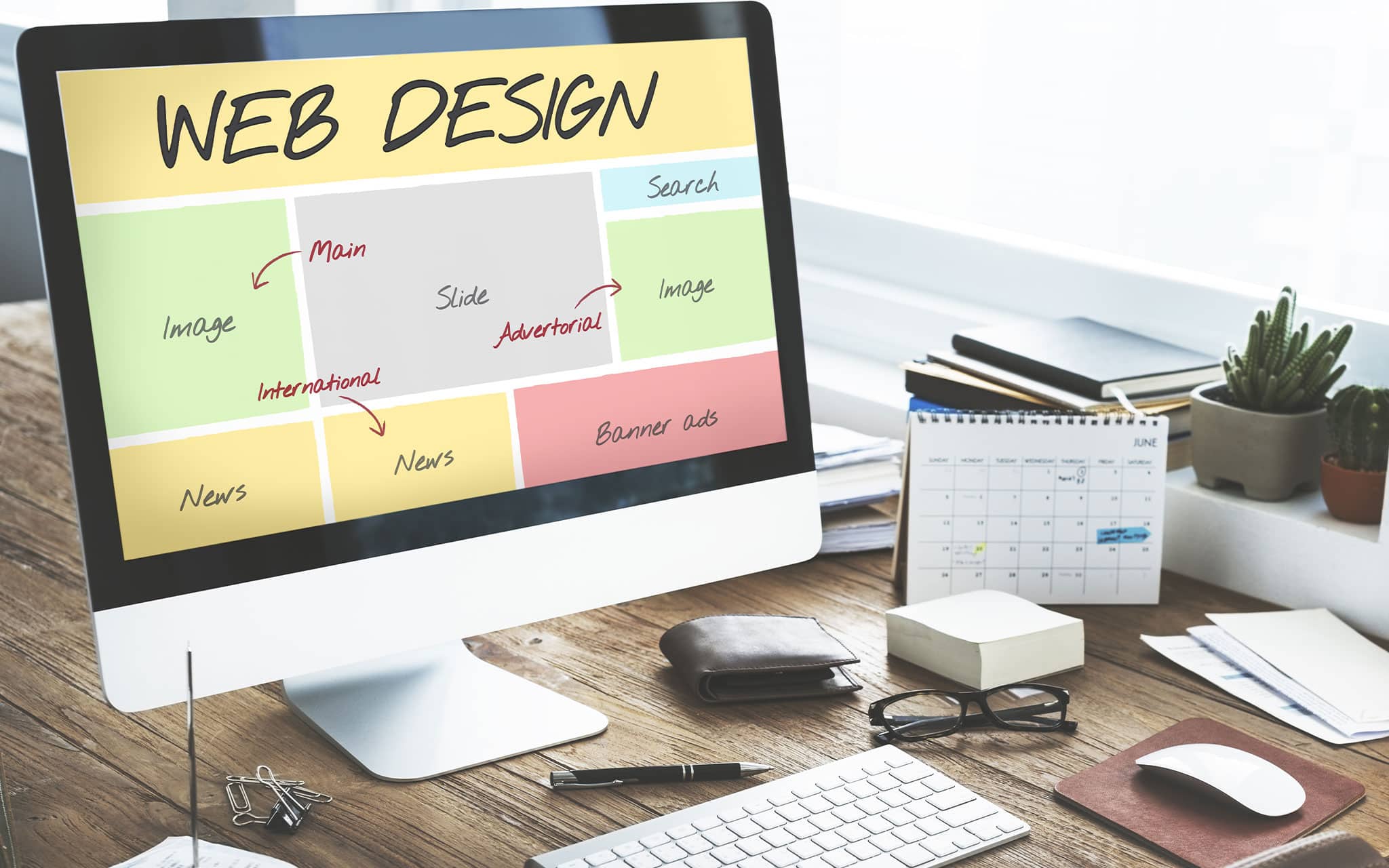
Understanding Responsive Website Design
Responsive website design is an approach that makes web pages render well on a variety of devices and screen sizes.
Responsive design is a matter of using CSS media queries to conditionally apply styles. Media queries are simple filters that can be used to target specific devices and viewport characteristics.
There are four main components of responsive design:
- Flexible Grid-Based Layout
- Flexible Images and Media
- Media Queries
- Responsive Design Approach
The first three components are fairly self-explanatory. A flexible grid-based layout means that your website’s content is organized into a grid and that the grid is fluid, meaning it can adjust to any screen size. Flexible images and media are images and media that scale down or up in size depending on the viewer’s screen size. Media queries are CSS rules that can be used to target specific devices and viewports.
The fourth component, a responsive design approach, is a bit more nebulous. A responsive design approach simply means that you’re taking a mobile-first approach to design, meaning you’re designing your website for mobile devices first and then adapting it for larger screens. This approach is important because it ensures that your website will be accessible and easy to use on all devices, no matter the screen size.
The Importance of Mobile-Friendly Design
With over two billion active mobile devices worldwide, it’s more important than ever for businesses to have a mobile-friendly website. Mobile devices are used for a variety of tasks, including searching the internet, checking email, playing games, and even making purchases. A mobile-friendly website ensures that your customers will have a positive experience when they visit your site, no matter what device they’re using.
If you’re not sure if your website is mobile-friendly, you can use Google’s Mobile-Friendly Test tool. Just enter your URL and Google will tell you if your site is mobile-friendly and give you some specific suggestions for improving the experience for mobile users.
Making your website mobile-friendly is essential in today’s market. By ensuring that your site is designed for mobile devices, you’ll be able to reach a wider audience and provide a better experience for your customers.
How Responsive Website Design Can Increase Sales
As the world increasingly moves online, businesses must adapt their custom website design to be responsive in order to remain competitive. A responsive website is one that is able to adapt to the different screen sizes and resolutions of various devices, such as smartphones, tablets, and laptops. This type of design is essential in order to provide users with a seamless experience regardless of the device they are using.
There are many benefits of having a responsive website, one of the most important being that it can help increase sales. Sales are the lifeblood of any business, so it’s no surprise that companies are always looking for new ways to increase them. One way that businesses are doing this is by making their websites more responsive. In today’s digital age, users are more likely to purchase products and services online if the website is responsive and easy to use. For many years, Google has advocated the use of mobile-friendly websites. In fact, Google found that 61% of users are unlikely to return to a website that is not mobile-friendly, and 40% of users will visit a competitor’s site instead. If your website is not responsive, you will likely lose out on potential customers.
A responsive website can also help you to rank higher in search engine results. Google now penalizes websites that are not mobile-friendly, so it is essential to have a responsive design if you want to rank well. In addition, a responsive website can help to improve your brand image and make your business appear more professional.
Overall, there are many reasons why you should consider making your website responsive. Doing so can help increase sales, improve your search engine ranking, and provide a better experience for your users.
Why Businesses Should Invest in Responsive Website Design
There are many benefits to using responsive website design. The most obvious benefit is that it allows your website to be displayed correctly on all devices. This is important because it ensures that your website is accessible to everyone, regardless of the device they’re using. Other benefits include:
1. Reaching More Customers
There are now more people using mobile devices to access the internet than ever before. This trend is only going to continue, which means that if you want to reach as many potential customers as possible, you need to have a responsive website.
2. Improving the User Experience
A responsive website provides an optimal viewing experience for your visitors, no matter what device they’re using. This is important because a positive user experience can lead to increased sales.
3. Increasing Conversion Rates
A responsive website can also help you increase your conversion rates. This is because a responsive website is easier to use and navigate, which means that more visitors will take the desired action (such as making a purchase).
4. Enhancing Your Brand Image
Finally, a responsive website can help you enhance your brand image. This is because a responsive website shows that you’re keeping up with the latest trends and that you’re committed to providing a good user experience for your visitors.
If you’re not already using responsive design, now is the time to make the switch. Doing so will help you reach more customers, improve the user experience, increase conversion rates, and enhance your brand image. All of which can lead to increased sales.
Conclusion
If you’re not using responsive design for your website, you’re missing out on a lot of benefits. Not only will you improve the user experience, but you’ll also improve your chances of ranking higher in search engines, increasing conversion rates, and improving your brand image. Make the switch to responsive design today and see how it can help your business grow.
If you want to invest in responsive web design, you’re going to need help from a qualified web designer. Fortunately, at StandOut Marketing, we specialize in website development, paid advertising, content marketing, and more. We are your partners when it comes to developing effective digital marketing strategies to grow your business. So if you’re looking for a team that can help you with custom website design, we’re the team for you. Book a discovery call today!